Sponsors

Around the web
Popular Recipes

Entries in graphic design (92)

Sunday
Sep232007

Brown

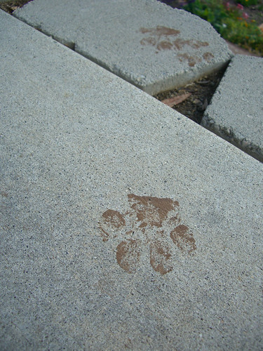
Brown is everywhere you turn. The dining room table, your favorite shoes and the kitchen cabinets. It's everywhere I turn, because every time I turn around I have two brown things at my feet.

Hot Dogs

Brown has never been a color that is in my usual palette. I didn't realize how much there was until I deliberately looked for it. From my two dogs, my freckles and my shaggy brunette husband I am constantly surrounded by brown.

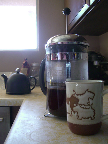
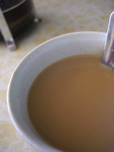
Every morning I saunter into the kitchen, put on the kettle and prepare tea or coffee for us. It's my favorite routine of the day. The house is quiet and cool and then I get a warm reward that I hug with my hands until my brain wakes up.

Morning routine

I often spend this time puttering about the kitchen and watching the tea or coffee steep. I gather the milk and sugar, pour my drink and add the milk slowly. I watch the white milk blend with the darkness in the mug making the coffee lighter and lighter.

Morning cuppa

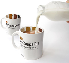
Thomas found these mugs, labeled on the inside with color matching chips so even bleary eyed you are assured the perfect ratio of milk to coffee. I'm secretly hoping for one for Christmas, but sadly I think they're only available in London.

MyCuppa mugs

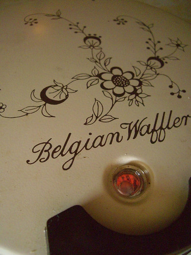
After coffee I can begin to function a bit more clearly. On a lazy weekend I like to pull out my Grandma's waffle maker and get cooking. It's wonderfully tan accented with brown trim and flowers.

Belgian Waffler

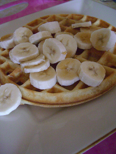
It always makes perfectly golden brown waffles that I serve with bananas and glossy maple syrup. Mmm.

Saturday waffles

Then the projects of the day begin and two smaller beings are awake and following my every move.

Brown paint

Friday
Sep212007

Green

Green seems to be a color that provokes the most emotion from people. My mom has always considered green to be her favorite color. One of my sisters has painted each house she's owned green. A friend of mine bellows an operatic note, "GREEEEN!", because she is so in love with the color.

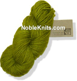
The one green item in particular that would provoke a woman-on-woman cat fight in my yarn store was Manos del Uruguay wool in citric. If there was only enough to make a felted handbag, or heaven forbid only one skein left on the rack, (that they knew of, I always had a personal stash of a skein or two to quell my own yarn anxiety) serious bartering would ensue. "I really need it this week," one yarnoholic would say.

"I have more on order and it should be in this week," I would console.

"OK, you can have it this week," says another junkie, "but you better bring me a cappuccino next week!"

Citric

Don't get between women and their yarn.

My sister's obsession with green goes above and beyond convention as well. Generally my sister's obsession with anything goes above and beyond convention, but green goes to new heights. I'm not talking about any green either. It must be bright lime green. Each house she's owned has been painted bright green, she'll have a lime handbag, and always a green company logo.

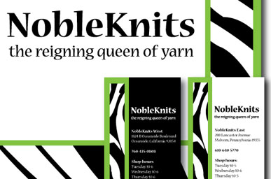
Luckily she is a designer that understands contrast and emphasis. Green is never used ad nauseum, it is always tastefully combined with excessive amounts of zebra stripe.

noblemix387x256

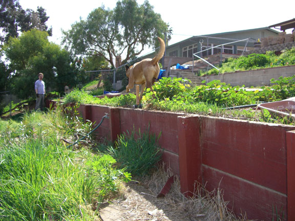
Green to me, on the other hand, has started to mean garden. Previously our yard looked like this:

the wall...

A cesspool of demon weeds called foxtails.

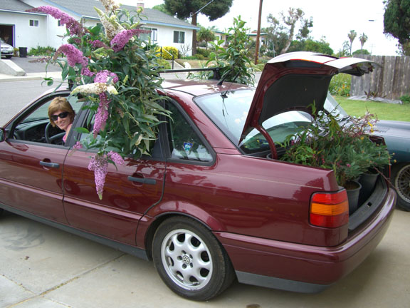
We cleaned the living hell out this yard. I did silly things like packing huge amounts of plants and my (other) sister into my car in successive trips to the local nursery.

All the flowers and two women...

In the process of working on our yard I developed a new appreciation for the color. I always thought plants had green leaves and the flower was the color excitement. Not the case. Leaves and greenery range in depth and hue from soft green of sage leaves to deep dark redish-green foliage of my nectarine tree.

Henri Matisse saw these subtleties long before I did, specifically choosing a different green for each leave in his painting, Goldfish.

Henri Matisse, Goldfish

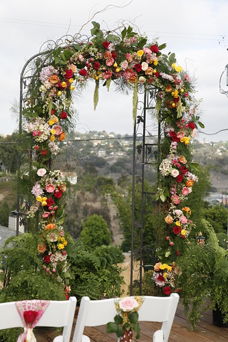
Green builds the perfect backdrop for the beauty of other colors including the remarkable colors of flowers. I have begun to look at green with new appreciation. Something I should have been doing all along. All that discovery and laborious work ultimately paid off because this was the setting for our wedding:

Arch

Thursday
Sep202007

Blue

The color that motivates the world to get out of bed each morning, blue has always been inspirational to me. I love to see the blue sky when I wake up in the morning. I find the sky to be the most fascinating part of life. It's never the same and whether it's dreary or California sunshine-ing it is always amazing.

I call this one sky-blue-pink.

sunrise3.6.07

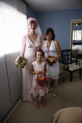
So to be certain I/we wake up in a good mood our bedroom mirrors what is hopefully outside the window.

Bridal party

My second color fascination is the ocean. Always reflecting the beautiful sky, the oceans never looks the same either. However, not always a brilliant blue hue, one minute it could be on the green spectrum and soon after it could look like this:

Ocean blue

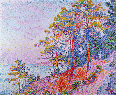
To me Paul Signac's painting Saint-Tropez, the Customs House bring ocean and sky together in a way that you can barely see the difference between the two. The horizon blends together and disappears. But for maximum contrast bright orange trees snap you back to reality and leads your eye around the rest of the scene.

Saint-Tropez, The Customs House by Paul Signac

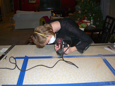
We love to be at home. Making our house the perfect place for us to call home has been not been easy but I get to use tons of blue tape. From building kitchen cabinets to a simple paint job we do all of our own work. Blue tape keeps paint edges straight but it also keeps cut edges from splintering. Thomas is the engineer and dreams up lots of projects. I have the steady hands and patience for the detail work... not that cutting a giant hole in the middle of your kitchen counter is 'detail work' but it did have to be straight which is where the patience comes in.

Blue tape

Tuesday
Sep182007

Orange

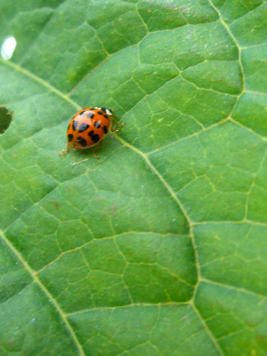
What else says, "Hey, look at me!", better than orange? It's warns of danger and it alerts you of important information. That's how the ladybug operates.

Exploring ladybug

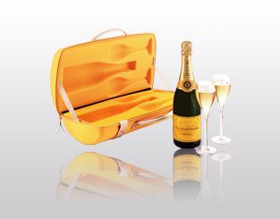
She warns you not to eat her, because if you do she's going to go rough you up. That's kind of what Veuve Clicquot says to me...

Veuve Clicquot

The orange label entices me, but it should warn me that the next day will be pretty rough. Apparently I don't have instincts. So I spend the day sipping my other favorite orange beverage.

Orange juice

Enough about my alcoholic stupor.

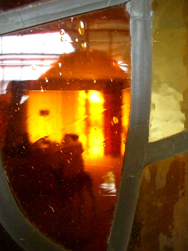
Orange escorts me to the 1970s. I was born at the end of the Seventies, so I don't have any real vision of what went on, but whenever I find something from that decade it is most certainly orange. Take our home for example, built in 1977. We have this amazing stained glass window that casts a dreamy orange glow through the afternoon.

Stained glass

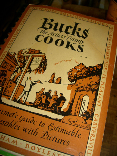
And check out these vintage cookbooks from my Grandma. They develop orange in ways I hadn't thought of for my designs. In this digital age it's so easy to print things off digital presses with full color, but not too long ago each color besides black you added to a print run cost more money. I love how this cookbook gets their money's worth out of the orange using it as the main color and then only a bit of black for definition.

Vintage Bucks County cookbook

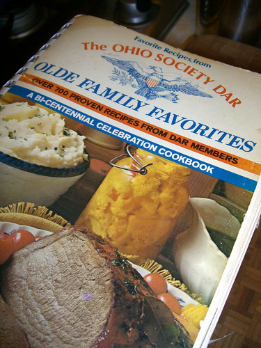
The DAR must have had a ton of money because this four-color cover must have cost a bundle. I love how they used the orange with it's contrast, blue. It goes right in order: blue type, orange type, blue eagle, orange shield accent, blue type, orange bar, blue bar. Then they even pick up their main colors in the photo, a cream bowl with a (wait for it...) blue rim! And look at that weird orange goo, centered! Talk about flow here people, they rocked it!

Vintage DAR cookbook

But today. This is how it rocks. Apple throws just enough orange on the iPhone to alert you of the important things, iPod!

iPod icon

Monday
Sep172007

Yellow

Welcome to Color Week. I love color and for the next seven days I will explore color and how it exists in my life and my design.

: :: ::: :: :

Bright and sunny, yellow for me is exciting. It's not a color I like to wear, but it is a color I love to see and use. Yellow brings feelings of excitement and happiness.

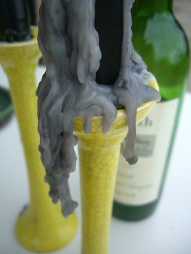
Like my cheery candlesticks that lit up the night for a late dinner on the deck:

Candlesticks

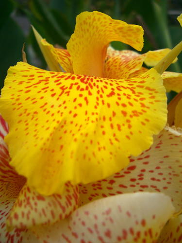
In nature, its used for attraction. Bold bright flowers tell the bees and hummingbirds, "Come over here! Get the good stuff."

Canna lilly

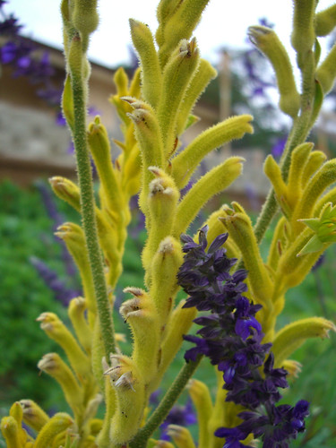
I love to plant yellow flowers in the garden because one placed strategically can draw the eye to a new point all the way across the yard. Using the principles of basic color theory, analogous or contrasting colors provide the most impact. I planted a bed with seven sets of three plants. 18 of the 21 plants have purple flowers, but three are yellow. Without fail, the yellow Kangaroo paw are the first plants guests talk about when the see the garden.

Contrasting colors

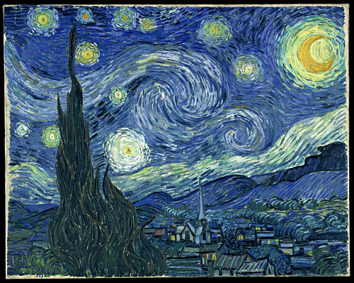
One of my favorite pieces of art uses the same concepts. The bright yellow moon brings Starry Night to life showing the viewer the village below.

Starry Night