What else says, "Hey, look at me!", better than orange? It's warns of danger and it alerts you of important information. That's how the ladybug operates.
She warns you not to eat her, because if you do she's going to go rough you up. That's kind of what Veuve Clicquot says to me...
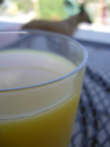
The orange label entices me, but it should warn me that the next day will be pretty rough. Apparently I don't have instincts. So I spend the day sipping my other favorite orange beverage.
Enough about my alcoholic stupor.
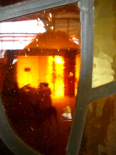
Orange escorts me to the 1970s. I was born at the end of the Seventies, so I don't have any real vision of what went on, but whenever I find something from that decade it is most certainly orange. Take our home for example, built in 1977. We have this amazing stained glass window that casts a dreamy orange glow through the afternoon.
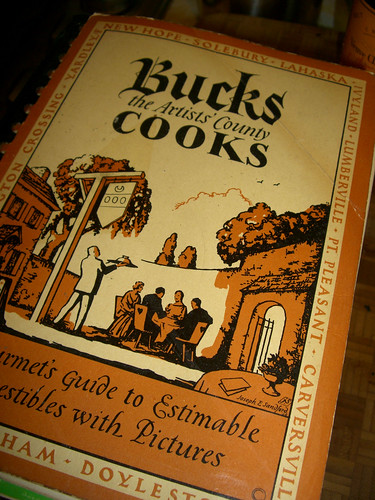
And check out these vintage cookbooks from my Grandma. They develop orange in ways I hadn't thought of for my designs. In this digital age it's so easy to print things off digital presses with full color, but not too long ago each color besides black you added to a print run cost more money. I love how this cookbook gets their money's worth out of the orange using it as the main color and then only a bit of black for definition.
The DAR must have had a ton of money because this four-color cover must have cost a bundle. I love how they used the orange with it's contrast, blue. It goes right in order: blue type, orange type, blue eagle, orange shield accent, blue type, orange bar, blue bar. Then they even pick up their main colors in the photo, a cream bowl with a (wait for it...) blue rim! And look at that weird orange goo, centered! Talk about flow here people, they rocked it!
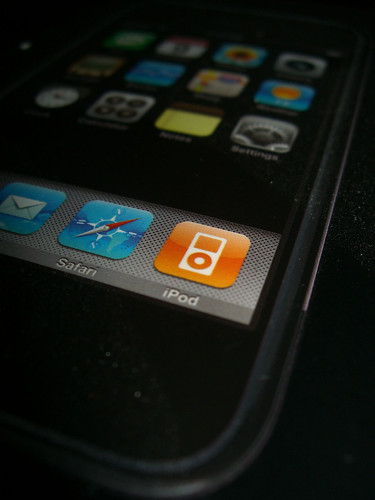
But today. This is how it rocks. Apple throws just enough orange on the iPhone to alert you of the important things, iPod!


