Sponsors

Around the web
Popular Recipes

Entries in art (11)

Thursday
Jan222009

Studio: Reborn

I am embarrassed to reveal this image but this is what my studio looked like 3 weeks ago. It had become a dumping ground for all miscellaneous home stuff. I regularly referred to it as "The Shit Pit." It sounds like a harsh name but it's really satisfying to say, try it some time.

Studio: before - aka The Shit Pit.

studio: before

Phew. That's over. My mother-in-law came to visit last week and first on the agenda was to clean this room. See that sofa thing with all the boxes piled on top? That pulls out making the guest bed. That means I not only had to clear off the bed but also make space on the floor.

Enter Giant Trashcan. I filled an entire curb-side trashcan with paper waste. Everything from magazines to paper scraps, used wrapping paper to stickers got stuffed into the can. With all that paper cleared away it gave me space to start organizing the yarn, paint and design supplies that previously littered my desk and cubbies. I rearranged nearly everything in the room and systematically put it back in more useful locations grouping similar items.

Studio: after - The Happiest Room in the House

studio

studio

I organized all my design supplies like pencil sharpeners, erasers and x-acto blades in a vintage green bowl that can be easily brought to my desk when I need to use it. I also have an inspiration bookshelf with a series of art and design books.

supplies and books

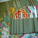
I had been struggling to get my yarn and knitting supplies organized but I finally have it all arranged with straight needles in a basket, notions all together in one place and a couple of cubbies filled some of my favorite yarns.

yarn cubbies

Lastly, I made a special corner with my easel.

easel corner

It feels really great to have my office simplified. It had been such a disaster I didn't even set foot in the room for days at a time. I really love having everything organized and easy to access it helps me get inspired to do great work.

Have you simplified or organized any overwhelming project recently?

Thursday
Nov062008

Photoshop Trainee

I have never been a huge fan of Photoshop. My favorite graphic design concepts are type, text and paper. Don't get me wrong, I love photographs but I prefer not to alter them too much from their original state. I like to boost the color, crop a little here and there, but extreme manipulation and surreal dreamscapes are not in my repertoire. But whispy landscapes are not the only thing that Photoshop can create. It is, of course, the most powerful photo engine on the market, and I have lost the slight edge I used to have on it.

When I was in college I didn't focus on the Photoshop classes that were offered to me because I chose marketing and management courses instead. Then in my first job I was only required to do minor photo editing. In my second job, no graphic design. Now as an independent graphic designer I find I really, um, must know how to use it better.

I have a couple of books but I find it hard to follow along to those with any devotion. What I did find that works are these videos of PixelPerfect hosted by Bert Monroy on Revision3 Internet TV. The guy is amazing. He goes click, click, and a throws on a filter or two and there you have it! A fabulous piece of digital art. They call him the Bob Ross of digital art. Remember Bob Ross? The old, odd art guy from PBS. Bert Monroy has the same gentle, encouraging tone. I love his videos, and I'm learning tons of new stuff!

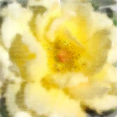
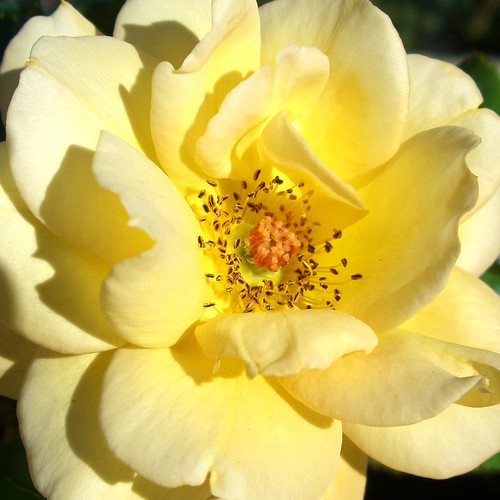
Here is a quickie watercolor lesson. We recreated a photograph with brushes and then gave it the texture of watercolor paper. Below is my version followed by the original photograph.

Bright Rose

Bright yellow rose

Monday
Oct062008

Object d'art

Everything is something else. I can watch this animation short by PES over and over. I just love it. (Via Mighty Girl.)


http://view.break.com/534274 - Watch more free videos

Sunday
Aug192007

A Project for Sunday

Because of the fact that we worked so hard before our wedding, we have not been doing any projects around the house. Well, until today. We were given three Bansky photographs from Thomas' Aunt Penni and Uncle Simon.

They arrived from England matted in white but unframed. We went out and bought frames, put the photos in the frames, but oops! The standard metric matte size is about 1/2 smaller all around than our 20x24 inch American frames.

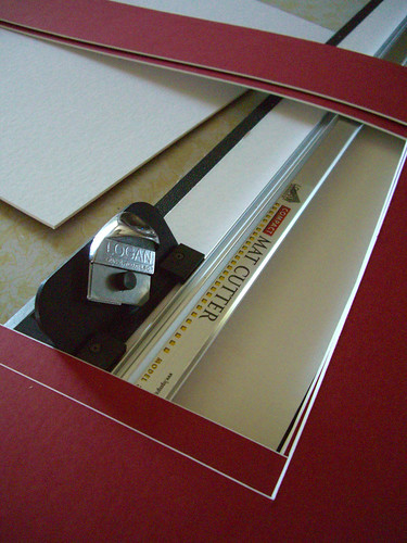
Luckily, Thomas gave me a matte cutter last Christmas. We thought we could get off easy and not have to cut mattes, but it turned out not to be that simple. I went back to the framing store, found a red matte that matches the red wall in our living room, ordered it, waited a week, went back to the framing store and collected our matte.

So today, framing. We measured and measured, stood back to think, measured some more and finally settled on a 3.5 inch boarder around each picture.

Matte boards for Banksy prints

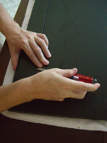
Then we put the the border in the frame, followed by the matted photograph and then the backer board.

Framing our Banksy prints

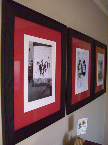
And here's what we have! We're thrilled with the result! Graphic, bold, anti-authority prints. Perfect.

Banksy prints

Thursday
Aug162007

So Charmed

Check out this charm bracelet from So Charmed. I love it.

socharmed1

Not exactly a bargain though. $385! But I thought the skull, guillotine and cake were pretty rad.

She has neat stuff on her Etsy shop too. Go check it out.