I have never been a huge fan of Photoshop. My favorite graphic design concepts are type, text and paper. Don't get me wrong, I love photographs but I prefer not to alter them too much from their original state. I like to boost the color, crop a little here and there, but extreme manipulation and surreal dreamscapes are not in my repertoire. But whispy landscapes are not the only thing that Photoshop can create. It is, of course, the most powerful photo engine on the market, and I have lost the slight edge I used to have on it.
When I was in college I didn't focus on the Photoshop classes that were offered to me because I chose marketing and management courses instead. Then in my first job I was only required to do minor photo editing. In my second job, no graphic design. Now as an independent graphic designer I find I really, um, must know how to use it better.
I have a couple of books but I find it hard to follow along to those with any devotion. What I did find that works are these videos of PixelPerfect hosted by Bert Monroy on Revision3 Internet TV. The guy is amazing. He goes click, click, and a throws on a filter or two and there you have it! A fabulous piece of digital art. They call him the Bob Ross of digital art. Remember Bob Ross? The old, odd art guy from PBS. Bert Monroy has the same gentle, encouraging tone. I love his videos, and I'm learning tons of new stuff!
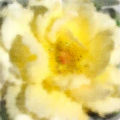
Here is a quickie watercolor lesson. We recreated a photograph with brushes and then gave it the texture of watercolor paper. Below is my version followed by the original photograph.

