Graphic Design: Coffee and Travel
 Monday, January 18, 2010 at 3:36PM
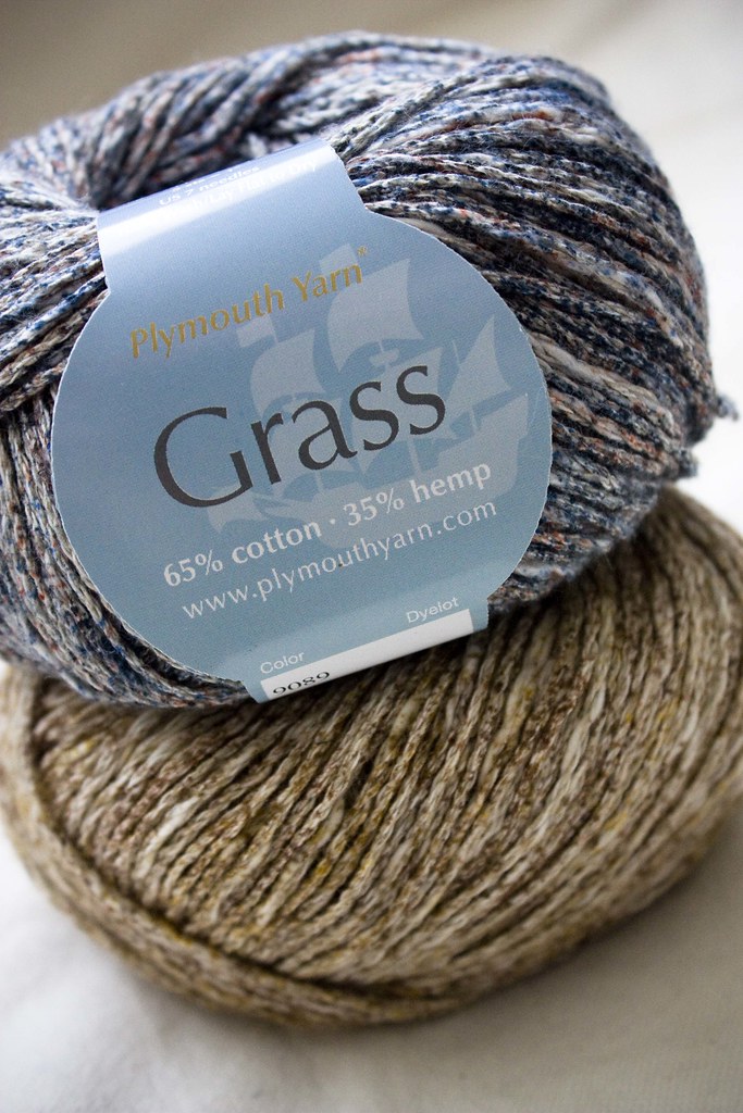
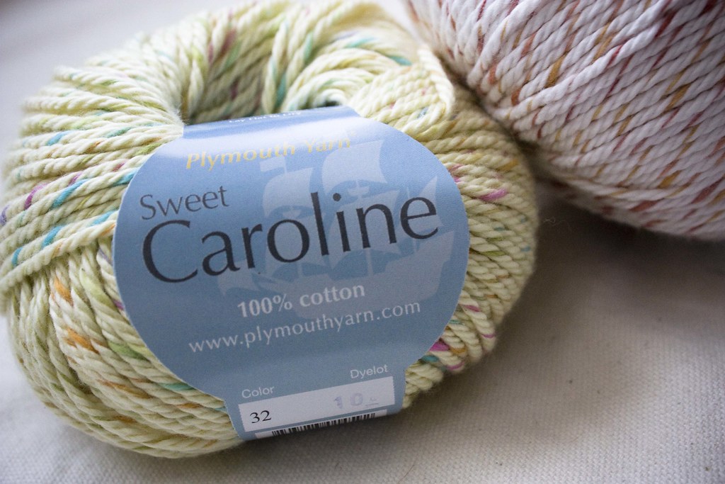
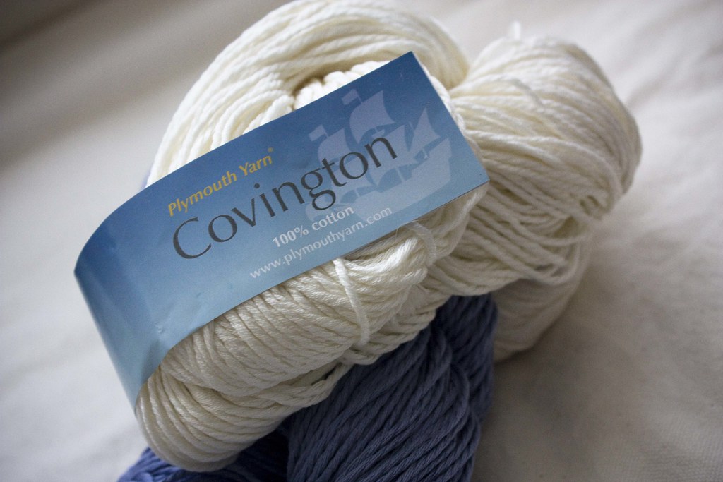
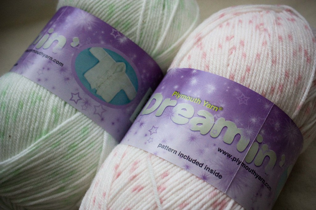
 One of today's design projects was a new yarn label for a fiber called Coffee Beenz. The yarn is intended for adult and sophisticated children's sweaters. A neutral color palette led the way for this coffee house inspired yarn.
To design the label I had to get thinking about coffee. I made myself a cappuccino as inspiration and sat down at my computer to research all things coffee.
I first hit the major coffee house players to see how they are selling coffee these days.

Starbucks, in the upper left hand corner, is clean and stark. I was surprised to find their site so white and so simplified from previous versions. I like it, but it wasn't the warmth I had in mind. Next up was The Coffee Bean & Tea Leaf. Their site invokes the the emotions that go with knitting, things like warmth, softness and comfort. I like all the layers and colors too. Seattle's Best on the bottom right was so red. I know their logo is red, but wow. I think a red label would be too strong for this yarn. Peet's rounds out my main search and I like their look that has warm tones and a foreign feel.
Also, Starbucks coffee bean bag.
By researching these and a few more samples I was able to narrow down the ideas I had for this yarn label. I like the browns, greens and tans. I like the feeling of foreign travel and the exotic locations coffee beans come from. I kept thinking of the old world, the seven seas, and traveling by boat. But I also wanted the label to be fresh and enticing.
Here's my final design approved by the client.
I chose a warm greenish-brown background with a slight gradient. The seal in the background I created from the company's logo to invoke the feeling of coffee farms in exotic foreign locations. For yarn name and other important information I used a rich tan. A couple hand drawn coffee beans add interest and fun. I can't wait to see it on the skein!
 graphic design
 Metalico Cowl {knitting pattern}
 There's A Chill in DeAire {blanket knitting pattern}
 Free: Quirky Quick Knit Scarf Knitting Pattern
 Fandago Cowl {free crochet cowl pattern}