Design Problem: Bulk Mailing Indicia
 Thursday, August 6, 2009 at 10:07AM
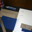
 Sometimes as a graphic designer I run into problems for which I just don't know the answer. Today's speed bump was a bulk mailing permit stamp to go on envelopes for a non-profit organization. The envelopes were already set to go on press but a last minute client email came in saying WE NEED THIS PLEASE!. It took me a minute to figure out what she wanted but then I realized it's those preprinted squares that say US Postage PAID. Like these:
My envelopes already had a certain style so my head started spinning and came back with: But do they have to look like that? Are they required to be a certain size? Must they be printed in black? All caps? San-serif?
The answer to all those questions is no. The stamp does not have to look exactly like that but it must have certain information and it must be clear and it must be in the upper right hand corner of the envelope. It took me a while to find the answers mainly because I didn't know what to call it. Is it a permit? Yes there is a permit number on there, but all the info for permit was how to apply for one. I had my client's permit number. What about bulk mailing envelope as my search terms. That gave me a huge selection of postage machines for printing postage right in your office, not what I needed. With a little more thought I typed in bulk mail imprint. Aha! It's amazing what you find when you use the lingo the USPS uses. That brought me to this link which has another handy link called "Designing a Permit Imprint." Wow! They actually thought of us designers. It turns out the correct name for it is Permit Imprint Indicia.
Your Permit Imprint Indicia must include the following:
Line 1: Rate Marking.
Line 2: The words “US Postage Paid.”
Line 3: City and state where permit is held.
Line 4: The words “Permit No.” and your permit number.
The key points are:
- It must show your city, state and permit number.
- It may be only four or five lines long.
- It must appear to the upper right of the delivery address. Include a clear space of at least 3/8 inch around the entire indicia and be no smaller than 1/2 inch high and 1/2 inch wide. It must not fall more than 1-1/2 inches below or left from the upper right corner of the envelope.
- Don't make any other design on your envelope that mimics or resembles the bulk mail permit.
I found the frighteningly long list of guidelines here. And my client is happy.
 graphic design
 Metalico Cowl {knitting pattern}
 There's A Chill in DeAire {blanket knitting pattern}
 Free: Quirky Quick Knit Scarf Knitting Pattern
 Fandago Cowl {free crochet cowl pattern}



Reader Comments (1)
I really appreciate your post. To run a successful email campaign, it's very necessary to have a pleasant and a tempting email design. An attractive email design can grab the attraction of recipients and encourage them to open your email. So while creating an email, you must focus on an attractive and compelling design to engage more and more audience.