A cohesive look
 Monday, June 29, 2009 at 4:27PM
Multiplicity - a bouncy, roving-like chunky wool
I've been working with Plymouth Yarn Company to create a new branding identity for their yarns. Plymouth felt that their yarns were being overlooked on store shelves because consumers did not realize the yarn was the product of this trusted company. Knitters are very loyal customers and Plymouth wanted to better capitalize on this fact. They came to me to create a new series of labels to identify them as the strong, quality yarn brand they are. Together we developed a recognizable label family that can be used across many types of yarn skeins.
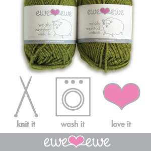
We made some important changes. We made sure the yarn name was clear and easily readable. Another important task was to include the yarn content right on the front of the ball so you don't have to turn it over or dig inside to figure out what it's made from. And to further the brand recognition we incorporated the large ship from the logo onto the front of the label.
 graphic design,
  knitting
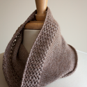 Metalico Cowl {knitting pattern}
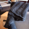 There's A Chill in DeAire {blanket knitting pattern}
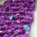 Free: Quirky Quick Knit Scarf Knitting Pattern
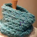 Fandago Cowl {free crochet cowl pattern}






Reader Comments (2)
very nice!
I love the fact that the content is easy to see, great job. m-in-l