Design portfolio tips
 Monday, April 14, 2008 at 3:07PM
 It's about the time of year when a fresh flock of new design talent will be hitting the streets, banging on doors, begging for jobs and hoping someone takes pity on them enough to give them a couple thousand dollars a month. The first and most important thing every young graphic designer needs is a strong portfolio. Here are some tips and hints on how to make a good portfolio great:
1. Quantity: How much should I have in my portfolio? To show a good sampling of your work your portfolio should have 10-15 pieces. But quantity does not equal quality. Less is more. If you have a few really strong pieces it's better to highlight them than show too much and have nothing stand out.
2. Substance: What should I have in my portfolio? You should tailor your portfolio depending on what kind of job you are looking for. If you want to be a web designer than you would need at least two well-developed website layouts. If you'd like to get into advertising then stock your case with different ad layouts, maybe a campaign for one company that includes print, web and outdoor ads. But for a general rule try to fit these parameters:
- Poster
- Logos
- Stationery suite
- Brochure
- Advertisements
- Catalog or annual report
- Invitation
- Magazine article layout
- Calendar
- Coordinated promotional piece
3. Presentation: What works best? Start strong and end strong. The order in which your projects are presented to your audience is very important. Lead with your best piece, end with your second-best and make sure there is another strong piece somewhere in the middle to hold interest.
4. Case: What kind of portfolio is best? There are two main types of cases to display your work, ring-bound plastic sleeves or my preference, a hard clam-shell case. I use a leather Spink & Gabor case that holds 15x20 inch boards. All boards should be the exact same size and black. Maintain similar margins around all projects and throughout your case. Whatever method you choose make sure you mount your projects cleanly and neatly. You don't get bonus points for this in the real world, only minus points. If the plastic sleeves are dirty, go buy some Windex and clean them. It must remain pristine. Maintaining a clean portfolio sub-consciously tells your audience that you will maintain and respect their property and projects.
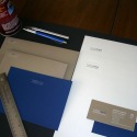
5. Resume: Can it be unique? Yes! It should be original and creative but also clear and legible. Design an envelope to go with it. You can also design a self-promotional piece that has samples of your work on it. Take extra copies of both to an interview and make sure to leave at least one behind on your way out.
Your portfolio is an extension of you. It shows how you work and how you think. If you keep it looking sharp and up to date you will never have a problem finding someone to show it too, and hopefully they will give you lots of money for all your hard work.
 graphic design
 Metalico Cowl {knitting pattern}
 There's A Chill in DeAire {blanket knitting pattern}
 Free: Quirky Quick Knit Scarf Knitting Pattern
 Fandago Cowl {free crochet cowl pattern}




Reader Comments (7)
These sound like great tips! Very valuable to designers just getting themselves started. Now if only I could get my photo portfolio going... :)
That's really good info...I got sucked into reading the whole thing. Do it right...or she's gonna yell!
what if the photos slide off the plastic sleeves? is there anything to avoid this?
These are good tips, just tweeted it to our Inkfruit followers :)
We are a t-shirt design portal you might wanna check us out.
Thanks so much for the info! Very informative and well said. :)
Wow, tips are really great! I always used to think the best way to manage a portfolio. However, I think now on I will follow the tips that you have shared. Thanks mate!
It's great to have your own portfolio where you can organize your websites. Thanks for the tips.
http://www.cluedesign.com.au/" rel="nofollow">web design Perth