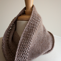
 Metalico Cowl {knitting pattern}
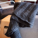 There's A Chill in DeAire {blanket knitting pattern}
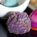
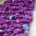 Free: Quirky Quick Knit Scarf Knitting Pattern
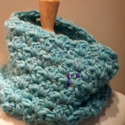 Fandago Cowl {free crochet cowl pattern}
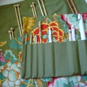


This week's good stuff
It's been awhile since I wrote my weekly good stuff post and I'd really like to get back into the routine and what better way to start a routine than to just do it.
Don't use black for shadows. Chris Coyier writes a good article about making shadows a darker tone of the item they fall on. For example, if a person's shadow falls across concrete don't just automatically made that shadow black but rather make it a darker tone of the concrete. While Chris' example is written for web design, it really falls across all design, painting and illustration.
Here's 40 trendy business card designs... always good for inspiration.
Invoicing is a necessary evil of being a freelance designer. Here's 15 good tips to make sure you keep on top of your billings. Stop scribbling your invoice notes on little pieces of paper that end up on the floor of your office and organize yourself with some software. It will save you time and earn you more money in the long run because you'll look more professional.
And if invoicing doesn't prove to you that being a freelance designer is a tough career choice then maybe you should read this article about whether or not freelancing is for you. If you'd rather stay in bed all day or don't necessarily like people then don't quit your day job.
This last item, via Frau Lipstick, is for the knitter and designer in me. It's a hilarious video produced by a sweater mill in Scotland that makes "700 billion cardigans a day." Watch it even if you're not a knitter, you'll still love it.

 Heather Walpole