Entries from February 1, 2009 - February 28, 2009
Orange you sad?
 Monday, February 23, 2009 at 11:29AM
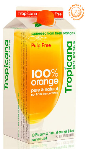
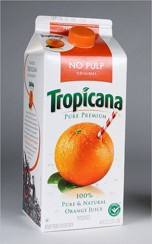
 Have you noticed the new Tropicana orange juice packaging? I like it.
It's bright and fresh with more white space and less clutter. But apparently I am in the minority of the opinionated. Since launching their new packaging Tropicana has been bombarded with a massive amount of negative feedback. The company is returning to its previous packaging. The New York Times writes,
The about-face comes after consumers complained about the makeover in letters, e-mail messages and telephone calls and clamored for a return of the original look.
Some of those commenting described the new packaging as “ugly” or “stupid,” and resembling “a generic bargain brand” or a “store brand.”
“Do any of these package-design people actually shop for orange juice?” the writer of one e-mail message asked rhetorically. “Because I do, and the new cartons stink.”
Others described the redesign as making it more difficult to distinguish among the varieties of Tropicana or differentiate Tropicana from other orange juices.
I think the new package looks very European, modern and clean. Everything in the grocery store with their BIG bold letters is trying to jump off the shelf to the passing consumer and it just doesn't work. The subtlety of this package spoke to me, and my husband and I even discussed how refreshing it looked.
I was happy to see the orange-with-a-straw-poking-from-it design disappear. I remember disliking it even as a child. The television ad would have a straw wielding kid hopelessly chasing around an orange on the loose. I'm sad to see it return. I thought it was gone for good.
Maybe I should have emailed Tropicana to let them know how much I liked the new look. It seems like the company was sent so much negative feedback that the started to doubt their own decision making abilities.
What do you think?
F.O. - Finished Object
 Thursday, February 19, 2009 at 4:09PM
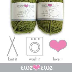
 As an avid knitter the only thing more exciting than receiving a box of yarn in the mail is receiving a box of yarn that has label I designed.
Project: To create a label for a new baby yarn that showed both youth and quality.
The label needed to speak for itself much like various other products that are on store shelves. Yarn has a slight advantage because it isn't sold in big, badly lit warehouses but rather small boutique stores. Consumers can ask a store clerk their opinion, potentially see knitted samples and be inspired by patterns. The yarn needs to appeal on touch and feel and also quality and value. Touch and feel are not factors I can change but the intangible ideas can be conveyed through the design of the label. Let's hope knitters like it!
Freshen up
 Wednesday, February 18, 2009 at 3:52PM
 Does this economy have you down? Are there less emails flowing through your inbox these days? Is the winter weather giving you cabin fever? Do you, as a freelancer feel like you're ready to hang yourself?
Sometimes working from home as a graphic designer can be the most rewarding job imaginable but other times it can be lonely and a little depressing. There aren't other coworkers pushing you along. It's just you, all day every day and sometimes that just isn't enough to keep you motivated.
I'm the same, of course. But Jaden over at Freelance Switch has some great tips on how to keep you, the freelancer, chugging along. Things like, "Don’t let the naysayers weigh you down," and, "Eat healthy." She also wisely advises you to watch less television and have more sex, both will get your brain working again.
Good luck and get back on the wagon!

 Metalico Cowl {knitting pattern}
 There's A Chill in DeAire {blanket knitting pattern}
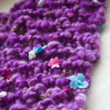 Free: Quirky Quick Knit Scarf Knitting Pattern
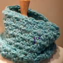 Fandago Cowl {free crochet cowl pattern}