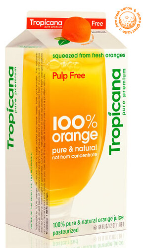
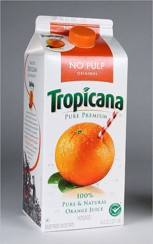
Have you noticed the new Tropicana orange juice packaging? I like it.

It's bright and fresh with more white space and less clutter. But apparently I am in the minority of the opinionated. Since launching their new packaging Tropicana has been bombarded with a massive amount of negative feedback. The company is returning to its previous packaging. The New York Times writes,
The about-face comes after consumers complained about the makeover in letters, e-mail messages and telephone calls and clamored for a return of the original look.
Some of those commenting described the new packaging as “ugly” or “stupid,” and resembling “a generic bargain brand” or a “store brand.”
“Do any of these package-design people actually shop for orange juice?” the writer of one e-mail message asked rhetorically. “Because I do, and the new cartons stink.”
Others described the redesign as making it more difficult to distinguish among the varieties of Tropicana or differentiate Tropicana from other orange juices.
I think the new package looks very European, modern and clean. Everything in the grocery store with their BIG bold letters is trying to jump off the shelf to the passing consumer and it just doesn't work. The subtlety of this package spoke to me, and my husband and I even discussed how refreshing it looked.
I was happy to see the orange-with-a-straw-poking-from-it design disappear. I remember disliking it even as a child. The television ad would have a straw wielding kid hopelessly chasing around an orange on the loose. I'm sad to see it return. I thought it was gone for good.
Maybe I should have emailed Tropicana to let them know how much I liked the new look. It seems like the company was sent so much negative feedback that the started to doubt their own decision making abilities.
What do you think?

 Wednesday, March 4, 2009 at 2:52PM
  news?
news? 
 Metalico Cowl {knitting pattern}
 There's A Chill in DeAire {blanket knitting pattern}
 Free: Quirky Quick Knit Scarf Knitting Pattern
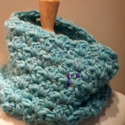 Fandago Cowl {free crochet cowl pattern}